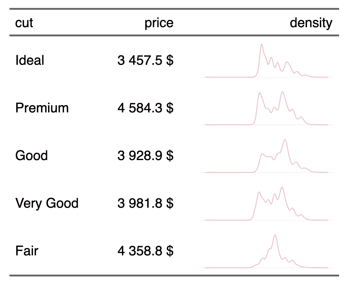
Table with density lines
To make this table, we will have to aggregate the data. Within this aggregation, we will also have to prepare the data that will be used for the density curves and arrange them in a column-list.
Packages used
We will use the ‘data.table’ package for the aggregation but we could also use ‘dplyr’.
library(flextable)
library(data.table)
Preparation of aggregated data
z <- as.data.table(ggplot2::diamonds)
z <- z[, list(
  price = mean(price, na.rm = TRUE),
  list_col = list(.SD$x)
), by = "cut"]
z
##          cut    price                          list_col
## 1:     Ideal 3457.542 3.95,3.93,4.35,4.31,4.49,4.49,...
## 2:   Premium 4584.258 3.89,4.20,3.88,3.79,4.38,3.97,...
## 3:      Good 3928.864 4.05,4.34,4.25,4.23,4.23,4.26,...
## 4: Very Good 3981.760 3.94,3.95,4.07,4.00,4.21,3.85,...
## 5:      Fair 4358.758 3.87,6.45,6.27,5.57,5.63,6.11,...
Production of the flextable
We use the function plot_chunk() and the option type = "dens". The function
will use the data stored in the column-list to create the corresponding density curve.
ft <- flextable(data = z) |>
  compose(j = "list_col", value = as_paragraph(
    plot_chunk(value = list_col, type = "dens", col = "pink",
               width = 1.5, height = .4, free_scale = TRUE)
  )) |>
  colformat_double(big.mark = " ", suffix = " $") |>
  set_header_labels(list_col = "density") |>
  autofit()
ftcut | price | density |
Ideal | 3 457.5 $ |
|
Premium | 4 584.3 $ |
|
Good | 3 928.9 $ |
|
Very Good | 3 981.8 $ |
|
Fair | 4 358.8 $ |
|


