‘flextable’ 0.9.11 has recently landed on CRAN. It ships two features we are happy to introduce:
- ‘patchwork’ integration: aligning a table and a plot used to be
a tedious exercise. It is now as simple as writing
wrap_flextable(ft) + my_plot. - native Quarto support with
as_qmd(): you can now use cross-references, captions and markdown directly inside cells.
‘patchwork’ integration
Combining and aligning a table and a plot has become possible
thanks to ‘patchwork’, which provides a system to build upon.
The new function
wrap_flextable()
relies on that system so that ‘flextable’ objects integrate
into ‘patchwork’ compositions via the +, | and / operators.
All options are detailed in the Plotting flextable section of the “flextable-book”.
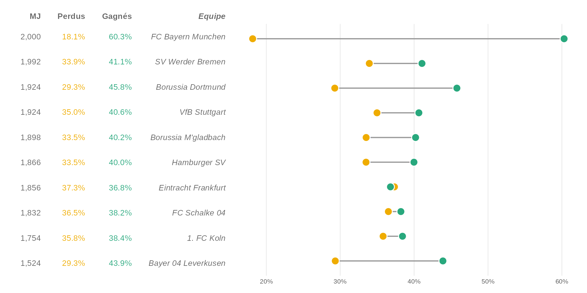
To illustrate, we build a dumbbell chart of Bundesliga team statistics paired with a matching ‘flextable’ (adapted from R Graph Gallery).
dataset <- data.frame(
  team = c(
    "FC Bayern Munchen", "SV Werder Bremen", "Borussia Dortmund",
    "VfB Stuttgart", "Borussia M'gladbach", "Hamburger SV",
    "Eintracht Frankfurt", "FC Schalke 04", "1. FC Koln",
    "Bayer 04 Leverkusen"
  ),
  matches = c(2000, 1992, 1924, 1924, 1898, 1866, 1856, 1832, 1754, 1524),
  won     = c(1206,  818,  881,  782,  763,  746,  683,  700,  674,  669),
  lost    = c( 363,  676,  563,  673,  636,  625,  693,  669,  628,  447)
)
dataset$win_pct  <- dataset$won  / dataset$matches * 100
dataset$loss_pct <- dataset$lost / dataset$matches * 100
dataset$team <- factor(dataset$team, levels = rev(dataset$team))
The dumbbell chart:
pal <- c(lost = "#EFAC00", won = "#28A87D")
df_long <- reshape(dataset, direction = "long",
  varying = list(c("loss_pct", "win_pct")),
  v.names = "pct", timevar = "type",
  times = c("lost", "won"), idvar = "team"
)

p <- ggplot(df_long, aes(x = pct / 100, y = team)) +
  stat_summary(
    geom = "linerange", fun.min = "min", fun.max = "max",
    linewidth = .7, color = "grey60"
  ) +
  geom_point(aes(fill = type), size = 4, shape = 21,
    stroke = .8, color = "white"
  ) +
  scale_x_continuous(
    labels = scales::percent,
    expand = expansion(add = c(.02, .02))
  ) +
  scale_y_discrete(name = NULL, guide = "none") +
  scale_fill_manual(
    values = pal,
    labels = c(lost = "Lost", won = "Won")
  ) +
  labs(x = NULL, fill = NULL) +
  theme(
    legend.position = "top",
    legend.justification = "left",
    panel.grid.minor = element_blank(),
    panel.grid.major.y = element_blank()
  )
p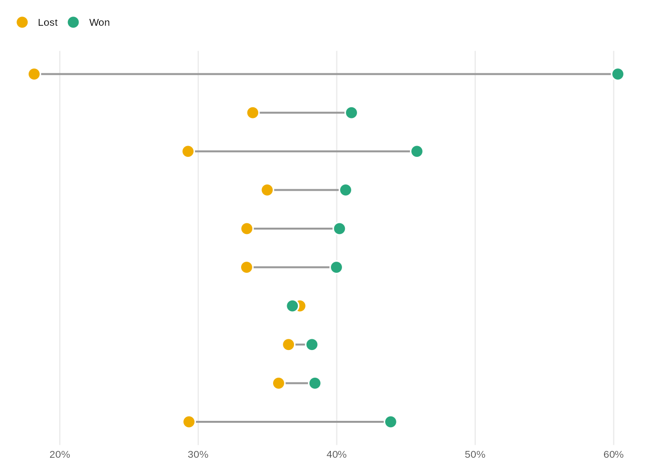
And the matching ‘flextable’:
ft_dat <- dataset[, c("matches", "win_pct", "loss_pct", "team")]
ft_dat$team <- as.character(ft_dat$team)

ft <- flextable(ft_dat) |>
  border_remove() |>
  bold(part = "header") |>
  colformat_double(j = c("win_pct", "loss_pct"), digits = 1, suffix = "%") |>
  set_header_labels(team = "Team", matches = "GP", win_pct = "Won", loss_pct = "Lost") |>
  color(color = c("#28A87D", "#EFAC00"), j = c("win_pct", "loss_pct")) |>
  italic(j = "team", italic = TRUE, part = "all") |>
  align(align = "right", part = "all") |>
  autofit()

ft
GP | Won | Lost | Team |
|---|---|---|---|
2,000 | 60.3% | 18.1% | FC Bayern Munchen |
1,992 | 41.1% | 33.9% | SV Werder Bremen |
1,924 | 45.8% | 29.3% | Borussia Dortmund |
1,924 | 40.6% | 35.0% | VfB Stuttgart |
1,898 | 40.2% | 33.5% | Borussia M'gladbach |
1,866 | 40.0% | 33.5% | Hamburger SV |
1,856 | 36.8% | 37.3% | Eintracht Frankfurt |
1,832 | 38.2% | 36.5% | FC Schalke 04 |
1,754 | 38.4% | 35.8% | 1. FC Koln |
1,524 | 43.9% | 29.3% | Bayer 04 Leverkusen |
Aligning rows with flex_body
When flex_body = TRUE, body rows stretch to match the height of the
adjacent plot panel. Each table row aligns with the corresponding
category on the y axis. Header and footer keep their fixed size.
wrap_flextable(ft, flex_body = TRUE, just = "right") +
  p +
  plot_layout(widths = c(1.1, 2))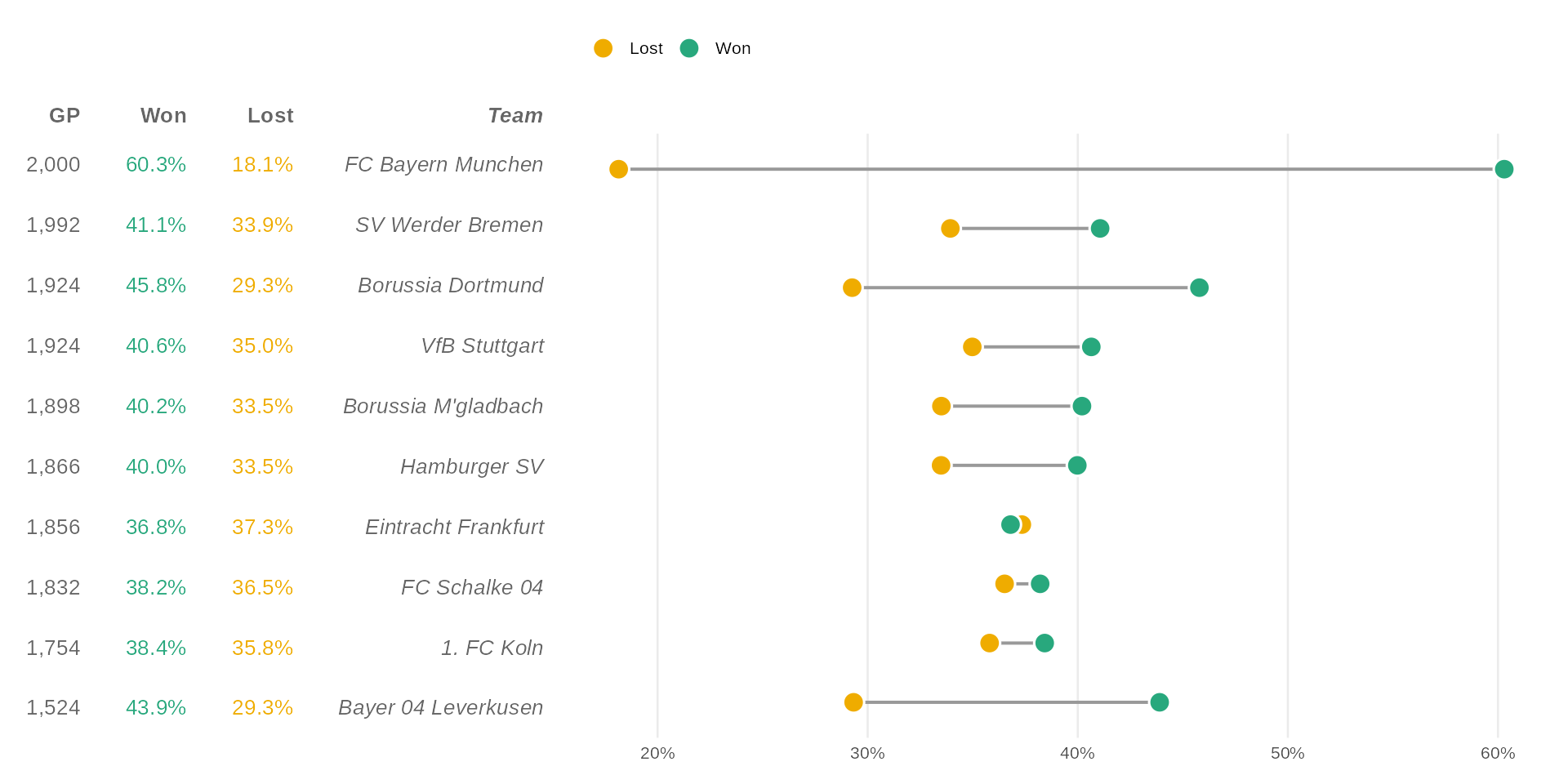
Table rows are perfectly aligned with the chart categories, table and plot become one and the world feels magical.
Aligning columns with flex_cols
When flex_cols = TRUE, data columns stretch to fill the panel width
determined by the adjacent plot. Each column aligns with the
corresponding category on the x axis.
cyl_mpg <- mtcars |>
  mutate(
    cyl = factor(cyl, levels = c(4, 6, 8), labels = c("4-cyl", "6-cyl", "8-cyl"))
  ) |>
  summarise(
    `mpg mean` = mean(mpg, na.rm = TRUE),
    `mpg sd` = sd(mpg, na.rm = TRUE),
    n = n(),
    .by = c(cyl)
  )

gg_bar <- ggplot(cyl_mpg, aes(cyl, `mpg mean`)) +
  geom_col(fill = "#28A87D", width = 0.7) +
  labs(x = "Cylinders", y = "Mean MPG") +
  theme(axis.text.x = element_blank())


cyl_pivoted <- cyl_mpg |>
  pivot_longer(
    cols = where(is.numeric)
  ) |>
  pivot_wider(
    id_cols = name,
    names_from = cyl, values_from = value,
    names_sort = TRUE
  )
cyl_pivoted
#> # A tibble: 3 × 4
#> name `4-cyl` `6-cyl` `8-cyl`
#> <chr> <dbl> <dbl> <dbl>
#> 1 mpg mean 26.7 19.7 15.1
#> 2 mpg sd 4.51 1.45 2.56
#> 3 n 11 7 14set_flextable_defaults(border.color = "#28A87D")
ft_cyl <- flextable(cyl_pivoted) |>
set_header_labels(name = "") |>
align(align = "center", part = "all") |>
align(align = "right", j = 1, part = "all") |>
colformat_double(i = 1:2, digits = 2) |>
colformat_double(i = 3, digits = 0) |>
autofit()
ft_cyl4-cyl | 6-cyl | 8-cyl | |
|---|---|---|---|
mpg mean | 26.66 | 19.74 | 15.10 |
mpg sd | 4.51 | 1.45 | 2.56 |
n | 11 | 7 | 14 |
wrap_flextable(ft_cyl, n_row_headers = 1, flex_cols = TRUE) /
  gg_bar +
  plot_layout(heights = c(1, 4))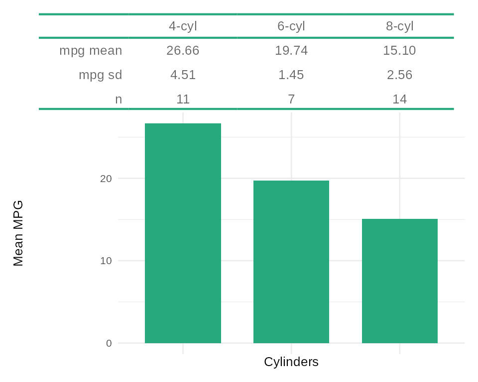
Here, each table column maps exactly to a bar in the chart, the whole thing reads as a single visualisation.
Quarto markdown in cells
‘flextable’ did not previously support markdown inside cells,
which meant that cross-references, math formulas and links
were not available within a Quarto document. The new as_qmd()
function fills that gap.
as_qmd() works with HTML, PDF and Word outputs.
To use it in a Quarto project, first install the companion
Lua filter extension with use_flextable_qmd(), then declare
the filter in the document YAML:
filters:
- flextable-qmd
- at: post-render
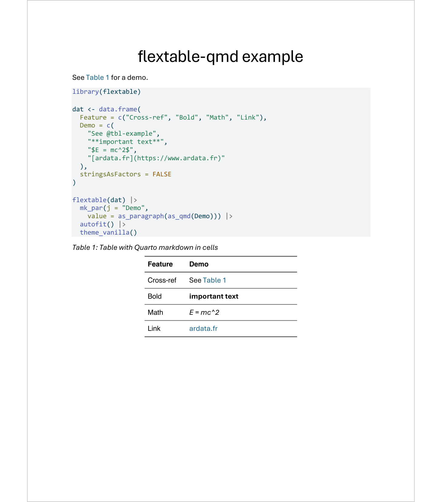
path: _extensions/flextable-qmd/unwrap-float.luaHere is an example Quarto document that uses as_qmd() for
cross-references and markdown formatting inside cells:
---
title: "flextable-qmd example"
format: docx
filters:
  - flextable-qmd
  - at: post-render
    path: _extensions/flextable-qmd/unwrap-float.lua
---

See @tbl-example for a demo.

```{r}
#| label: tbl-example
#| tbl-cap: Table with Quarto markdown in cells
library(flextable)

dat <- data.frame(
  Feature = c("Cross-ref", "Bold", "Math", "Link"),
  Demo = c(
    "See @tbl-example",
    "**important text**",
    "$E = mc^2$",
    "[ardata.fr](https://www.ardata.fr)"
  ),
  stringsAsFactors = FALSE
)

flextable(dat) |>
  mk_par(j = "Demo",
    value = as_paragraph(as_qmd(Demo))) |>
  autofit() |>
  theme_vanilla()
```
The result in a Word document:
 The docx file can be downloaded here: quarto-as-qmd-fr.docx
Feel free to try out these new features.
For the full list of changes, see the changelog.
Follow us: - Recommanded sites: R-bloggers R weekly Twitter #rstats Jobs for R-users