Ajouter des flextable à vos graphiques ggplot2
La dataviz dont nous nous sommes inspiré est disponible à l’adresse https://insights.datylon.com/stories/oDHVikVxaCaCGWRFGMdPgA.
Récupérer les données
library(readxl)
library(tidyverse)
library(magick)
## Linking to ImageMagick 6.9.12.3
## Enabled features: cairo, fontconfig, freetype, heic, lcms, pango, raw, rsvg, webp
## Disabled features: fftw, ghostscript, x11

scoring_data <- read_excel("default_workbook.xlsx",
           sheet = "Scoring data") %>%
  rename(name = NAME, pts = PTS, fgp = "FG%", group = Group) %>%
  mutate(pts = as.double(pts),
         fgp = as.double(fgp))
scoring_data
## # A tibble: 581 × 4
##    name                    fgp   pts group
##    <chr>                 <dbl> <dbl> <chr>
##  1 Joel Embiid            49.9  30.6 Ineffective high-scorer
##  2 LeBron James           52.4  30.3 Effective high-scorer
##  3 Giannis Antetokounmpo  55.3  29.9 Effective high-scorer
##  4 Kevin Durant           51.8  29.9 Effective high-scorer
##  5 Luka Doncic            45.7  28.4 Ineffective high-scorer
##  6 Trae Young             46    28.4 Ineffective high-scorer
##  7 DeMar DeRozan          50.4  27.9 Effective high-scorer
##  8 Kyrie Irving           46.9  27.4 Ineffective high-scorer
##  9 Ja Morant              49.3  27.4 Ineffective high-scorer
## 10 Nikola Jokic           58.3  27.1 Effective high-scorer
## # … with 571 more rows
Pour les images du tableau, il faut créer manuellement un data.frame. On va télécharger chaque image dans un fichier temporaire car flextable ne gère que les images disponible localement.
head_shot <- tibble::tribble(
  ~name, ~url,
  "Joel Embiid", "https://cdn.nba.com/headshots/nba/latest/1040x760/203954.png",
  "LeBron James", "https://cdn.nba.com/headshots/nba/latest/1040x760/2544.png",
  "Giannis Antetokounmpo", "https://cdn.nba.com/headshots/nba/latest/1040x760/203507.png",
  "Kevin Durant", "https://cdn.nba.com/headshots/nba/latest/1040x760/201142.png",
  "Trae Young", "https://cdn.nba.com/headshots/nba/latest/1040x760/1629027.png",
  "Luka Doncic", "https://cdn.nba.com/headshots/nba/latest/1040x760/1629029.png"
) %>%
  mutate(url = map_chr(url, function(z) {
    path <- tempfile(fileext = ".png")
    image_read(z) %>%
      image_resize(geometry = "144x") %>%
      image_write(path = path)
    path
  }))
Le tableau ‘Q3_data’ va être utilisé lors de la construction du ggplot.
Q3_data <- summarise(scoring_data,
          pts = quantile(pts, probs = .75),
          fgp = quantile(fgp, probs = .75)
          )
Q3_data
## # A tibble: 1 × 2
##     pts   fgp
##   <dbl> <dbl>
## 1  11.3    50
Le tableau ‘scoring_highlight’ va être le tableau principal.
scoring_highlight <- scoring_data %>%
  arrange(desc(pts), desc(fgp)) %>%
  slice_max(pts, n = 6) %>%
  left_join(head_shot, by = "name")
scoring_highlight
## # A tibble: 6 × 5
##   name                    fgp   pts group                   url
##   <chr>                 <dbl> <dbl> <chr>                   <chr>
## 1 Joel Embiid            49.9  30.6 Ineffective high-scorer /var/folders/08/2qd…
## 2 LeBron James           52.4  30.3 Effective high-scorer   /var/folders/08/2qd…
## 3 Giannis Antetokounmpo  55.3  29.9 Effective high-scorer   /var/folders/08/2qd…
## 4 Kevin Durant           51.8  29.9 Effective high-scorer   /var/folders/08/2qd…
## 5 Trae Young             46    28.4 Ineffective high-scorer /var/folders/08/2qd…
## 6 Luka Doncic            45.7  28.4 Ineffective high-scorer /var/folders/08/2qd…
Créer le flextable
theme_scorer <- function(x) {
border_remove(x) %>%
valign(valign = "center", part = "all") %>%
align(align = "center", part = "all") %>%
fontsize(part = "all", size = 20) %>%
bold(part = "header", bold = TRUE) %>%
bold(part = "body", j = 1, bold = TRUE) %>%
color(color = "#b17268", part = "header") %>%
bg(part = "header", bg = "transparent")
}
ft <- as_grouped_data(scoring_highlight, groups = c("name"), expand_single = TRUE) %>%
as_flextable(hide_grouplabel = TRUE, col_keys = c("url", "fgp", "pts")) %>%
set_header_labels(url = "", fgp = "Field goal", pts = "Points") %>%
mk_par(j = "url", i = ~ !is.na(url),
value = as_paragraph(
as_image(url, width = .75, height = 0.54),
"\n",
as_i(name)
)
) %>%
theme_scorer() %>%
align(i = ~!is.na(name), align = "left", part = "body") %>%
bg(i = ~ group %in% "Effective high-scorer", bg = "#f8b26399") %>%
bg(i = ~ group %in% "Ineffective high-scorer", bg = "#b1726899") %>%
hline(i = rep(c(FALSE, TRUE, FALSE, TRUE), length = nrow_part(.))) %>%
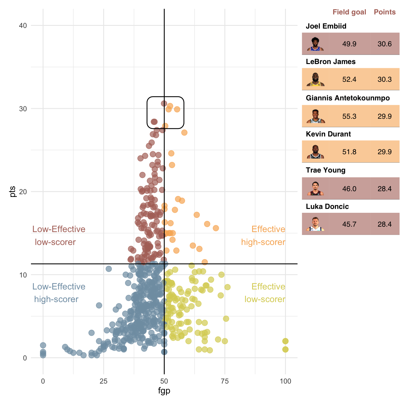
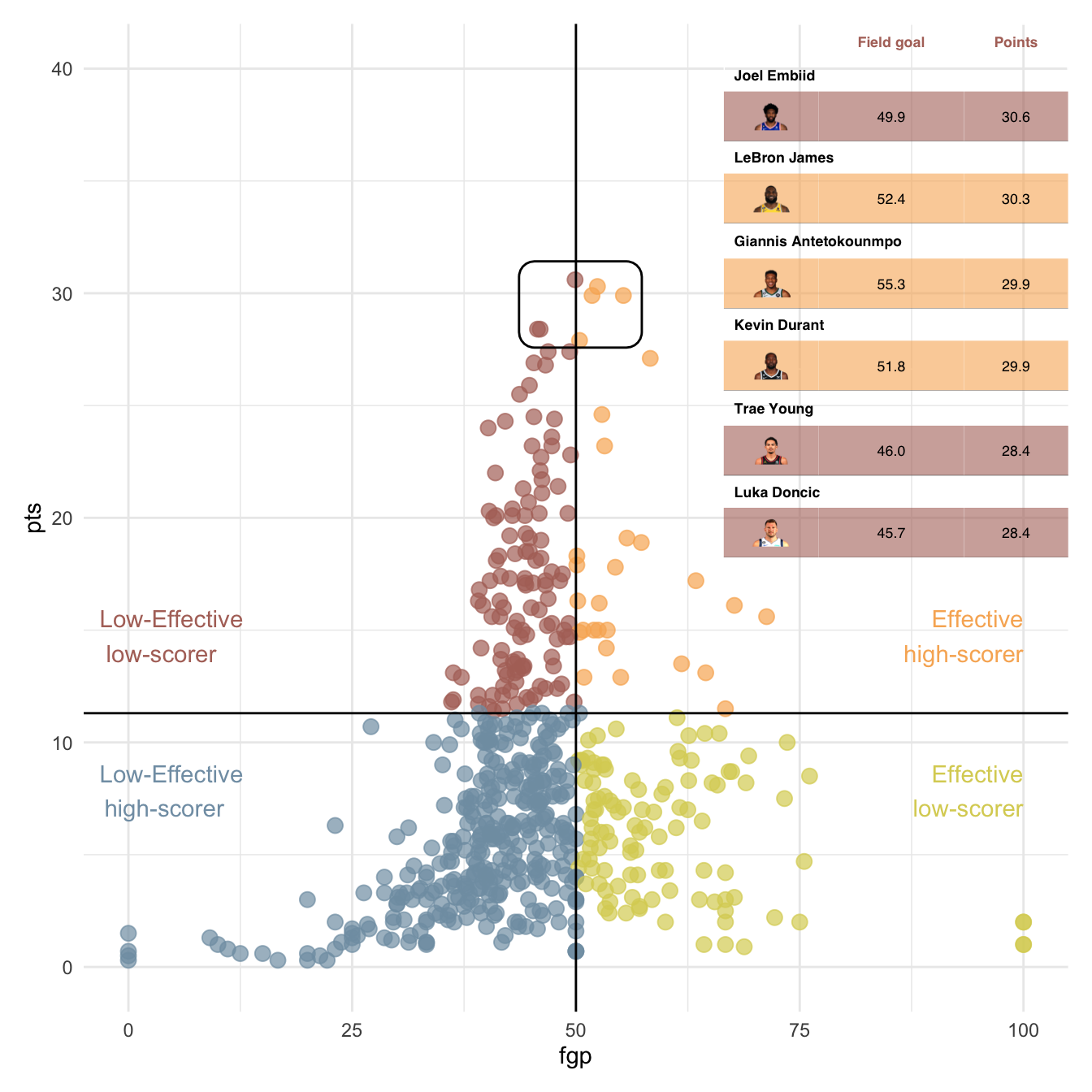
autofit()Nous pouvons déjà transformer le tableau en un graphique.
plot(ft, fit = "fixed", scaling = "fixed", just = "centre")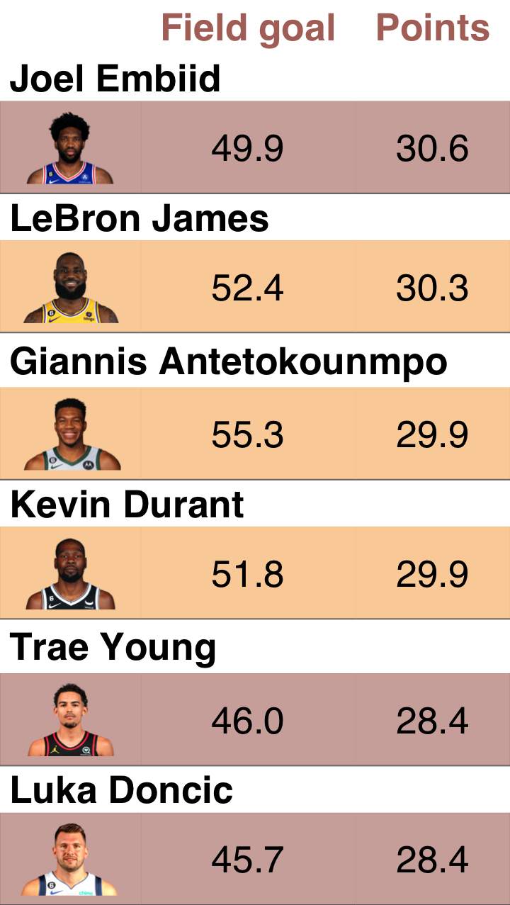
Création du ggplot
gg <- scoring_data %>%
  ggplot(mapping = aes(x = fgp, y = pts, color = group)) +
  geom_point(size = 3, alpha = .7, show.legend = FALSE) +
  scale_color_manual(
    values = c(
      "Effective high-scorer" = "#f8b263",
      "Ineffective low-scorer" = "#819eb2",
      "Ineffective high-scorer" = "#b17268",
      "Effective low-scorer" = "#dad162"
      )) +
  scale_y_continuous(limits = c(0, 40)) +
  geom_hline(data = Q3_data, aes(yintercept = `pts`)) +
  geom_vline(data = Q3_data, aes(xintercept = fgp)) +
  ggforce::geom_mark_rect(data = scoring_highlight,
                   mapping = aes(color = NULL),
                   expand = unit(3, "mm"),
                   show.legend = FALSE) +
  annotate(geom = "text", x = 100, y = Q3_data$pts,
           label = "Effective\nhigh-scorer", color = "#f8b263",
           hjust = 1, vjust = -1) +
  annotate(geom = "text", x = 100, y = Q3_data$pts,
           label = "Effective\nlow-scorer", color = "#dad162",
           hjust = 1, vjust = 2) +
  annotate(geom = "text", x = 0, y = Q3_data$pts,
           label = "Low-Effective\nhigh-scorer", color = "#819eb2",
           hjust = 0.2, vjust = 2) +
  annotate(geom = "text", x = 0, y = Q3_data$pts,
           label = "Low-Effective\nlow-scorer", color = "#b17268",
           hjust = .2, vjust = -1) +
  theme_minimal()
gg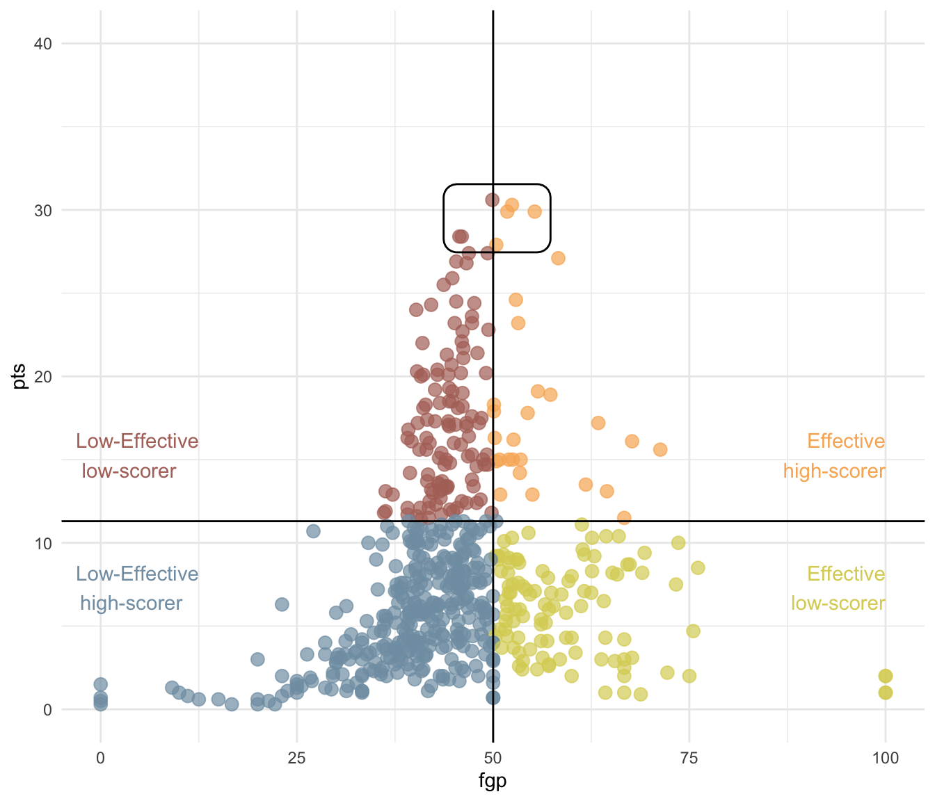
Ajout du flextable dans le ggplot
library(patchwork)
gg + inset_element(
    gen_grob(ft, fit = "width"),
    left = 0.65, bottom = .65,
    right = 1, top = 1
  )  + theme(
    plot.background = element_rect(fill = "transparent"),
    panel.background = element_rect(fill = "transparent")
  )
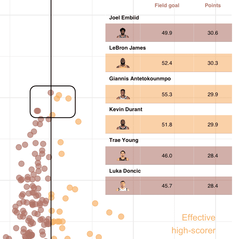
Ajout du flextable à côté du ggplot
gg + gen_grob(ft, fit = "width")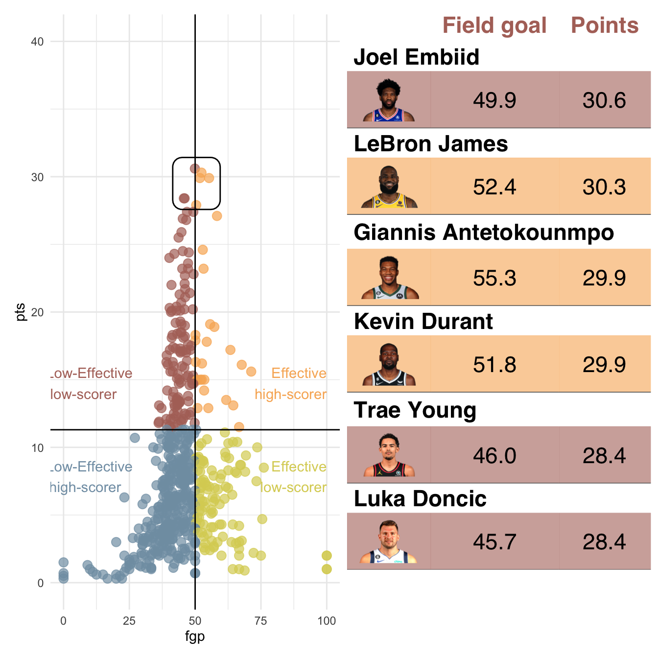
gg + gen_grob(ft, fit = "width") + plot_layout(ncol = 2, widths = c(3, 1))