2 Customizing girafe animations
You can customize tooltip style, mouse hover effects, toolbar position and many details.
This requires usage of css instructions and options. The function girafe has an argument options, a list of options to customize the rendering with calls to dedicated functions, i.e. opts_tooltip(), opts_toolbar(), opts_hover(), …
We will use the following graphic to illustrate available options:
library(tidyverse)

mtcars_db <- rownames_to_column(mtcars, var = "carname")

gg_scatter <- ggplot(
  data = mtcars_db,
  mapping = aes(
    x = disp, y = qsec, color = wt,
    # here we add iteractive aesthetics
    tooltip = carname, data_id = carname
  )
) +
  geom_point_interactive(size = 3, hover_nearest = TRUE)
gg_scatter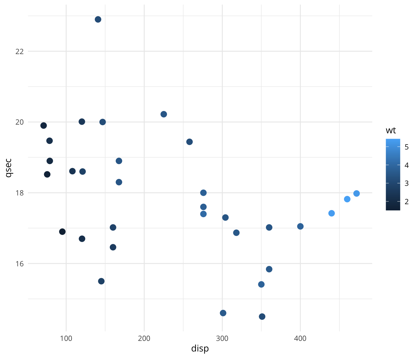
2.1 Global option definition
Default values are frequently used when creating “girafe” objects. It is recommended to specify them only once in the R session in order to obtain homogeneous interactive graphics.
When a ‘girafe’ is created (when function girafe() is called), some default values are used as the css for hover effects or css for tooltips.
User can read them with function girafe_defaults().
z <- girafe_defaults()
z$opts_hover$css
[1] ".hover_data_SVGID_ { fill:#f24f26;stroke:#333333;cursor:pointer; }\ntext.hover_data_SVGID_ { stroke:none;fill:#f24f26; }\ncircle.hover_data_SVGID_ { fill:#f24f26;stroke:#333333; }\nline.hover_data_SVGID_, polyline.hover_data_SVGID_ { fill:none;stroke:#f24f26; }\nrect.hover_data_SVGID_, polygon.hover_data_SVGID_, path.hover_data_SVGID_ { fill:#f24f26;stroke:none; }\nimage.hover_data_SVGID_ { stroke:#f24f26; }"These default properties will be used when creating the graphics. They can be updated with function set_girafe_defaults().
To set global options that apply to all graphics and get homogeneous interactive behavior and design, call set_girafe_defaults() at the beginning of your R Markdown document or R script.
Options passed to girafe() are merged with these defaults rather than replacing them entirely. This means you can set a global tooltip CSS once and still override only offx or offy in a specific girafe() call without losing your CSS styling.
css_default_hover <- girafe_css_bicolor(primary = "yellow", secondary = "red")

set_girafe_defaults(
  opts_hover = opts_hover(css = css_default_hover),
  opts_zoom = opts_zoom(min = 1, max = 4),
  opts_tooltip = opts_tooltip(css = "padding:3px;background-color:#333333;color:white;"),
  opts_sizing = opts_sizing(rescale = TRUE),
  opts_toolbar = opts_toolbar(saveaspng = FALSE, position = "bottom", delay_mouseout = 5000)
)

girafe(ggobj = gg_scatter)
2.2 Graphic size
Sizing in ggiraph involves two distinct concepts:
- Aspect ratio: defined by
width_svgandheight_svg(in inches, defaults: 6 and 5). These arguments control the shape of the SVG viewbox and the resolution of the graphic produced by the R device. The aspect ratio never changes after creation. - Display size: how the graphic fits in its HTML container. This is controlled by
opts_sizing().
2.2.1 Responsive mode (default)
By default (opts_sizing(rescale = TRUE)), the graphic scales to fill the available width while preserving its aspect ratio. The width parameter (between 0 and 1) controls the fraction of the container width to use:
girafe(
  ggobj = gg_scatter,
  options = list(opts_sizing(rescale = TRUE, width = .5))
)
2.2.2 Fixed size mode
With opts_sizing(rescale = FALSE), the graphic is displayed at its exact SVG dimensions (width_svg x height_svg converted to inches). It will not resize when the container changes:
girafe(
  ggobj = gg_scatter,
  options = list(opts_sizing(rescale = FALSE))
)
2.2.3 In R Markdown / Quarto
When using girafe() inside an R Markdown or Quarto document, leave width_svg and height_svg unset so that the knitr chunk options fig.width and fig.height are used automatically.
2.2.4 In Shiny
In a Shiny application, the display size is controlled by girafeOutput(). width_svg / height_svg still define the aspect ratio and the SVG resolution, not the display size.
width |
height |
Behaviour |
|---|---|---|
"100%" (default) |
NULL (default) |
Responsive: fills the available width, height adjusts to preserve the aspect ratio. No minimum height is imposed. |
"100%" |
"400px" |
Responsive width, but the height is capped at 400px. The graphic may be letter-boxed if the aspect ratio does not match. |
NULL |
NULL |
Fill mode: the container expands to fill all available space in its parent. Useful inside bslib::page_fillable() or dashboards where the graphic should occupy the full page area. |
2.3 Tooltip options
Tooltip visual aspect and position can be defined with function opts_tooltip().
2.3.1 Tooltip position
The arguments offx and offy of function opts_tooltip() are used to offset tooltip position. Default offset is 10 pixels horizontally to the mouse position (offx=10) and 0 pixels vertically (offy=0).
girafe(
  ggobj = gg_scatter,
  options = list(
    opts_tooltip(offx = 20, offy = 20)
  )
)
If argument use_cursor_pos is set to FALSE, the tooltip will be fixed at offx and offy.
girafe(
  ggobj = gg_scatter,
  options = list(opts_tooltip(
    offx = 60,
    offy = 60, use_cursor_pos = FALSE
  ))
)
2.3.2 Tooltip style
The function opts_tooltip() has an argument named css. It can be used to add css declarations to customize tooltip rendering.
Each css declaration includes a property name and an associated value. Property names and values are separated by colons and name-value pairs always end with a semicolon. For example
color:gray;text-align:center;. Common properties are :
- background-color: background color
- color: elements color
- border-style, border-width, border-color: border properties
- width, height: size of tooltip
- padding: space around content
- opacity: background opacity (default to 0.9)
Let’s add a pink rectangle with round borders and a few other details to make it nice:
tooltip_css <- "background-color:#d8118c;color:white;padding:5px;border-radius:3px;"
girafe(
  ggobj = gg_scatter,
  options = list(
    opts_tooltip(css = tooltip_css, opacity = 1),
    opts_sizing(width = .7)
  )
)
Do not surround css value by curly braces, girafe function takes care of that.
2.3.3 Auto coloring
In function opts_tooltip(), set argument use_fill to TRUE and the background color of tooltip will always use use elements’fill property to color tooltip. Argument use_stroke is to be used to apply the same to the border color of the tooltip.
girafe(
  ggobj = gg_scatter + scale_color_viridis_c(),
  options = list(
    opts_tooltip(use_fill = TRUE),
    opts_sizing(width = .7)
  )
)
Package ggiraph enable elements to be dynamic when mouse is hovering over them. This is possible when an element is associated with a data_id.
The dynamic aspect of elements can be defined with css code by the user. There are several ways to define these settings.
2.4 Hover effects
The elements that are associated with a data_id are animated when the mouse hovers over them. Clicks and hover actions on these elements are also available as reactive values in shiny applications.
These animations can be configured using the following functions:
opts_hover()for the animation of panel elementsopts_hover_key()for the animation of the elements of the legendsopts_hover_theme()for the animation of the elements of the theme
These functions all have a css argument that defines via CSS instructions the style to use when the mouse passes over them. css here is relative to SVG elements. SVG attributes are listed here. Common properties are:
- fill: background color
- stroke: color
- stroke-width: border width
- r: circle radius (no effect if Firefox is used).
To fill elements in yellow and add a black stroke, opts_hover call should be used as below:
girafe(
  ggobj = gg_scatter,
  options = list(
    opts_hover(css = "fill:yellow;stroke:black;stroke-width:3px;")
  )
)
Another option can be used to alter aspect of non hovered elements. It is very useful to highlight hovered elements when the density of the elements is high by fixing less opacity on the other elements.
dat <- readRDS("data/species-ts.RDS")

gg <- ggplot(dat, aes(x = date, y = score,
                      colour = species, group = species)) +
  geom_line_interactive(aes(tooltip = species, data_id = species)) +
  scale_color_viridis_d() +
  labs(title = "move mouse over lines")

x <- girafe(ggobj = gg, width_svg = 8, height_svg = 6,
  options = list(
    opts_hover_inv(css = "opacity:0.1;"),
    opts_hover(css = "stroke-width:2;")
  ))
x
2.4.1 Linked hover between legend and geometries
By default, hovering a legend key only highlights the legend element, and hovering a geometry only highlights the geometry. Setting linked = TRUE in opts_hover() links both: hovering a legend key highlights the corresponding geometries, and hovering a geometry highlights the corresponding legend key.
For this to work, the scale must be made interactive with a scale_*_interactive() function so that legend keys have interactive attributes.
gg_bar <- ggplot(
  data = diamonds,
  mapping = aes(x = color, fill = cut, data_id = cut)) +
  geom_bar_interactive(
    aes(tooltip = sprintf("%s: %.0f", fill, after_stat(count)))
  ) +
  scale_fill_discrete_interactive(
    data_id = function(breaks) breaks,
    tooltip = function(breaks) breaks
  )

girafe(ggobj = gg_bar,
  options = list(
    opts_hover(css = "fill:black;", linked = TRUE),
    opts_hover_key(css = "fill:black;"),
    opts_hover_inv(css = "opacity:0.5;")
  ))
2.4.2 Detailled control
Now there are cases where css expressions will have to be configured with more caution.
Let’s have a look at the following example ; if you put your mouse hover points or text, you will see that the animation is not adapted to the text. Text should instead be animated with another css property.
gg <- ggplot(head(mtcars_db), aes(
  x = disp, y = qsec, label = carname,
  data_id = carname, color = wt
)) +
  geom_text_interactive(vjust = 2) +
  theme_minimal()

girafe(
  ggobj = gg,
  options = list(
    opts_hover(css = "fill:red;stroke:black;")
  )
)
Function girafe_css is to be used in that case, it allows to specify individual styles for various SVG elements.
girafe(
  ggobj = gg,
  options = list(
    opts_hover(
      css = girafe_css(
        css = "fill:purple;stroke:black;",
        text = "stroke:none;fill:red;"
      )
    )
  )
)
2.5 Zoom
You can activate zoom; set zoom_max (maximum zoom factor) to a value greater than 1. If the argument is greater than 1, a toolbar will appear when mouse will be over the graphic.
Click on the icons in the toolbar to activate or desactivate the zoom.
girafe(
  ggobj = gg_scatter,
  options = list(
    opts_sizing(width = .7),
    opts_zoom(max = 5)
  )
)
By default, pan/zoom must be activated by the user via the toolbar button. Set default_on = TRUE to activate pan/zoom automatically when the plot is rendered:
girafe(
  ggobj = gg_scatter,
  options = list(
    opts_sizing(width = .7),
    opts_zoom(max = 5, default_on = TRUE)
  )
)
2.6 Toolbar
A toolbar is added by default to the graphs at the top right. It contains at least the download button for the PNG version of the graph.
It will contain other elements depending on the options used. If a zoom has been configured, the zoom options will be added to it. If a selection is configured and the graph is in a shiny application, the selection options will be added to it, i.e. selection and anti-selection.
Toolbar position can be defined with function opts_toolbar() and argument position. Valid values are 'topright' (default), 'top', 'bottom', 'topleft', 'bottomleft' and 'bottomright'.
girafe(
  ggobj = gg_scatter,
  options = list(
    opts_sizing(width = .7),
    opts_toolbar(position = "bottomright")
  )
)
The toolbar also includes a fullscreen button that lets users expand the graphic to fill the entire screen.
2.6.1 Fixed toolbar
By default the toolbar floats above the graphic and appears on mouse over. Set fixed = TRUE to make it always visible and positioned before the SVG element (i.e. above the graphic in the HTML flow). This is useful when the toolbar must remain accessible at all times, for example in dashboards or when the graphic is tall and the floating toolbar might be hard to reach.
girafe(
  ggobj = gg_scatter,
  options = list(
    opts_sizing(width = .7),
    opts_toolbar(position = "top", fixed = TRUE)
  )
)